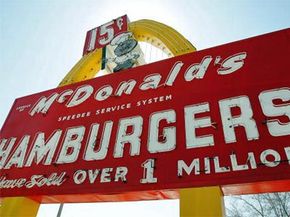
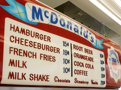
If you hopped in a time machine, set the dial for 1948 and found yourself at the counter of McDonald's first self-service restaurant, you'd have all of nine menu items to choose from. Not on the list? French fries, which weren't added to the menu until the following year. Instead of Ronald McDonald, you'd find "Speedee" Chef, the winking, hamburger-headed mascot for the restaurant until 1962. And the Golden Arches, the stylized yellow "M" known worldwide as the McDonald's logo, would be missing altogether.
How did McDonald's come up with the cultural icon known as the Golden Arches? With a little imagination, you could easily see the logo as a couple of flexible french fries placed next to one another. After all, the McDonald's mascot at the time did have a hamburger for a head, so the restaurant clearly wasn't averse to incorporating food into its designs. In reality, however, the inspiration for the Golden Arches stemmed from architecture rather than food.
Advertisement
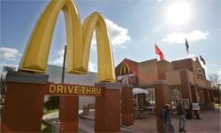
After the initial success of the first McDonald's restaurant, founders Dick and Mac McDonald looked to franchise their operation. Working with architect Stanley Meston, the brothers designed a red-and-white-themed, walk-up restaurant with a distinctive slanted roof. Dick found the design a little plain and proposed adding two giant yellow arches, running from the front to the restaurant to the back, to both sides of the building. For good measure, they placed another arch sporting their "Speedee" logo to serve as a sign for the restaurants. For years, the arches remained only an architectural feature of the restaurants.
In 1962, however, McDonald's looked to modernize its logo (and, according to some, avoid unflattering comparisons of its "Speedee" chef character with Alka-Seltzer's "Speedy" mascot). When viewed from a certain angle, the arches framing McDonald's restaurants formed an "M," so the company incorporated the arches into its new logo. In fact, early versions of the Golden Arches have a diagonal line, representing the roofline of the restaurants, cutting across the middle of the "M." The new logo proved a huge success, and the company stuck with the design even as McDonald's began removing the architectural golden arches from its restaurants throughout the sixties.
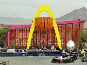
In fact, the McDonald brothers could have never dreamed of some of the places their humble logo would turn up years later. Read on to see what we mean.
Advertisement


